Top Insurance Analyst: High-Vax Regions Show a 15% Higher Mortality Rate in 2022 Than in 2021
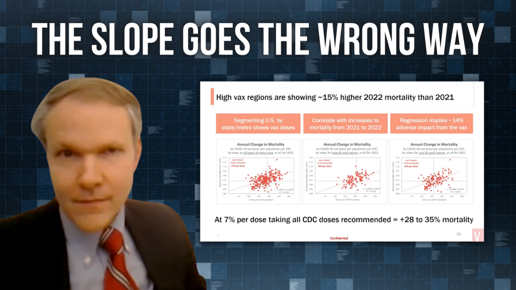
“The slope goes the wrong way.”
https://rumble.com/embed/v206hmm/?pub=un5t1
“I have some never-before-seen anywhere — wasn’t in D.C. [data],” announced Josh Stirling as he joined Edward Dowd and Steve Kirsch Thursday (12/22/22) during a live video stream.
Mr. Josh Stirling is a highly-recognized insurance research analyst. And his eye-opening testimony during Ron Johnson’s (R-WI) Covid-19 vaccine hearing made quite a splash on December 7.

He has an entire catalog of data that he could cite, but this particular information he presented to VSRF provides some damning evidence against the Covid-19 injections.
Here’s the Chart
It’s a scatter plot, which includes the CDC’s data on vaccination rates. On the X axis (left and right) is the number of Covid-19 injection doses per 100 population. And on the Y axis (up and down) is the all-cause mortality rate of 2022 compared to 2021 (2022 mortality divided by 2021 mortality).
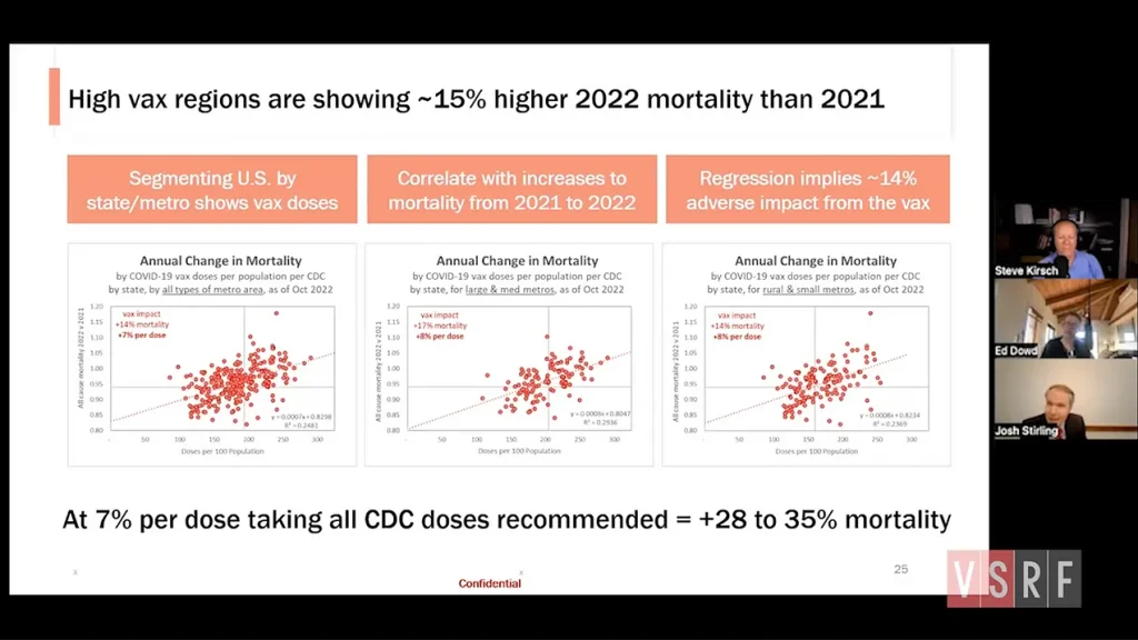
And as you can see, as the number of doses per 100 population increases, so does all-cause mortality.
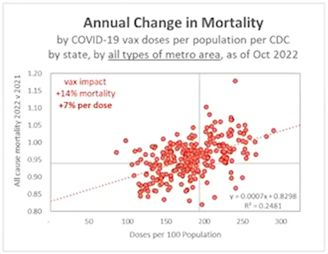
“The fact that it’s upwardly sloping to the right and the regression line makes this simple to understand. But [what] you could see, even without the regression line, is basically that the parts of our country which have had more doses of the vaccine are now having higher increased mortality in 2022 relative to their levels in 2021,” explained Stirling.
Josh then takes the data “one step further.”
Each dose of the Covid-19 injection, according to Josh’s chart, is associated with about a 7% increase in mortality on average. And overall, highly-vaccinated regions saw a 15% higher 2022 mortality rate than 2021.
He explains, “If we went down the slope (the red dotted line), you can see that if we were at zero doses, we would have something like 14% lower deaths [than 2021]. But if you go one step further. Thank goodness everybody didn’t take the vaccine! Because you can see that these things are anchored at around 200 doses per [100] persons. Well, we were supposed to take 400 — or 500 if you’re over 50. And so actually, if you just do the math on this, if we had followed the CDC’s advice, instead of having a 14 or 15% higher mortality, we would probably have [around] a 28 or 35% higher mortality rate, right now!”
Josh then expresses gratitude for those who woke up and stopped taking shots or took no shots at all.
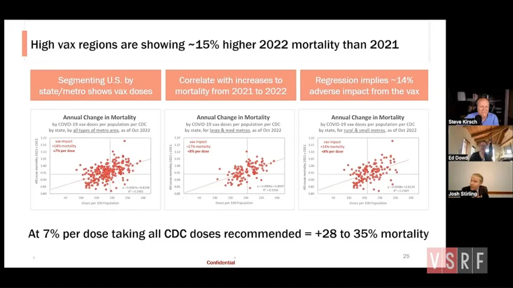
“Just thank goodness we didn’t all take the shots. And those of us who took one stopped at one, and those that took two realized they didn’t need to take a booster.”
“It’s — it’s stunning,” replied Steve Kirsch. “If Chris Martenson was doing a video on this slide, I know what he would say.”
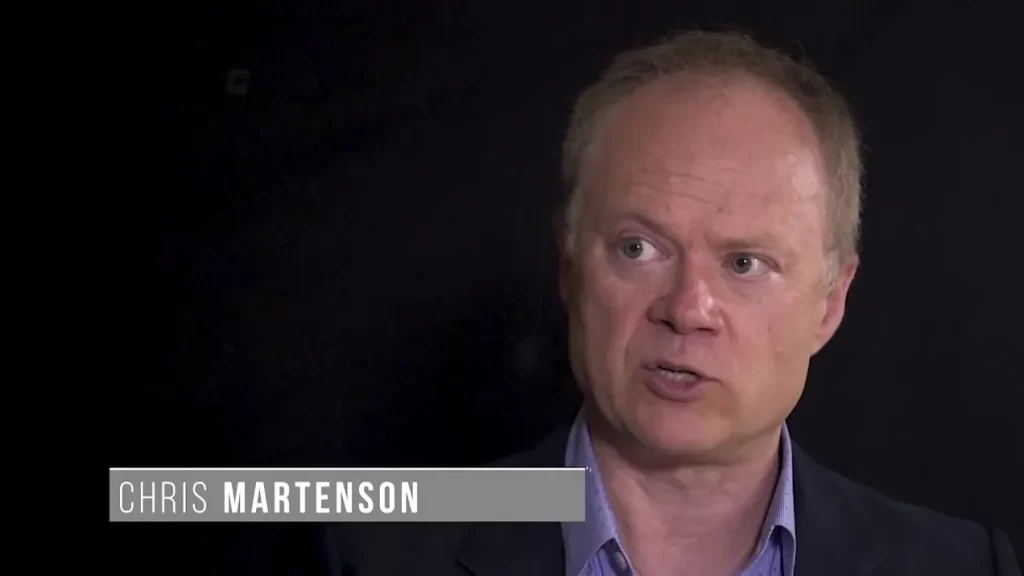
“He would say, ‘The slope goes the wrong way.’” In simple terms, the more you vaccinate, the higher your mortality.
-End-
Thanks for reading. The entire video with Josh Stirling and Edward Dowd is included below.
Full Episode #60: Covid Cover-Up: Ed Dowd & Josh Sterling
https://rumble.com/embed/v1zfxdm/?pub=mbdkr
And a special thanks to Dr. Naomi Wolf and DailyClout.io for bringing me on as a member of their team. They have a lot of ambitious goals for 2023, especially on the legal front.
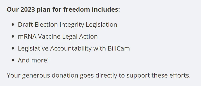
So, if you’d like to support an organization with the know-how to make a real impact, please consider subscribing to DailyClout’s newsletter and making a donation.
One of our country’s most important freedoms is that of free speech.
Agree with this essay? Disagree? Join the debate by writing to DailyClout HERE.


