Blockprobe: What is it and why one engineer felt compelled to innovate with it

These blocks are then used to build visualizations for the story that are presented in a dashboard for your audience to view. The visualizations are presented as a dashboard.
At the very top of the dashboard is the title. Below the title is the summary visualization, which is just a banner that keeps changing the text every 10 seconds. Not every dashboard has a summary. Anybody could run through this visualization to get a summary of the entire story.
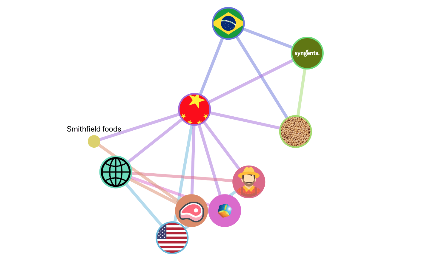
Below the summary is the Mind-Map. Every mind-map has entities (nodes) and connections. These entities capture your story. When the viewer clicks on any entity, they get all the paragraphs related to that specific entity.
These paragraphs effectively form a ‘mini-story’ that could be used to understand the entity in the context of the story.
The advantage of the mind-map visualization is that one does not need to read the whole article. The viewer could just select one specific entity of his/her choice and view the “mini-story” that tells all about that entity in the context of the larger story.
By clicking a “connection” between two entities, only those paragraphs where both those entities are relevant appear.
The last visualization is the timeline that shows the chronological order of events.
Here is an example of what the finished product would look like: “Why the US is correct in putting Tariffs on China.”
This tool is most useful to independent journalists who may not have all the money or expertise to code these visualizations on their own.
Currently, I am making the visualizations myself using the tool for other interested parties. Once I am done making the tool more user-friendly, anybody can use the tool to create visualizations.


